Upshot Coffee
Visual Identity | Typography
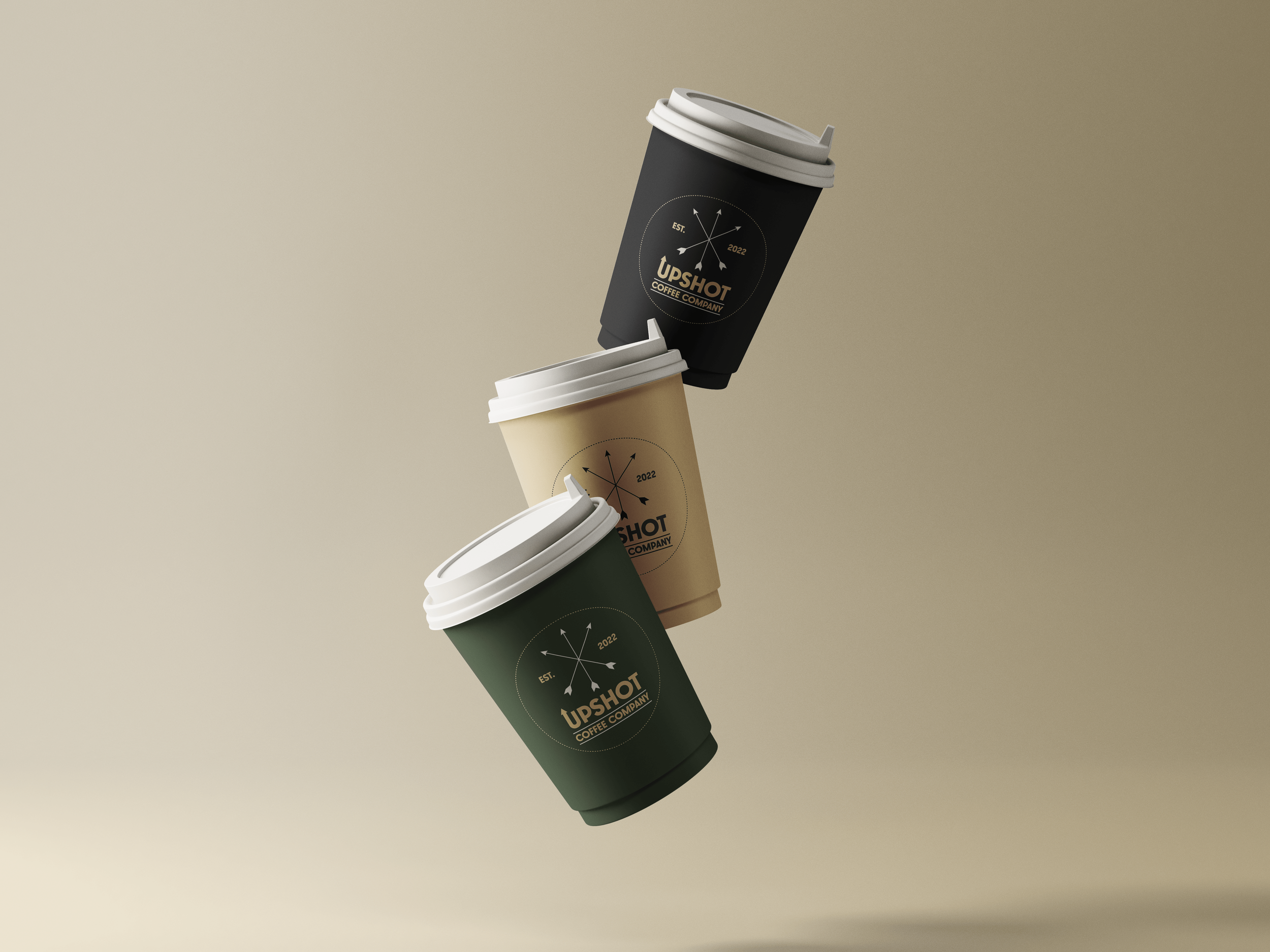
Upshot Coffee Company is a recently opened cafe in Whitby, Ontario. I was hired to do the branding and was given a very specific brief: to capture the feeling of being outdoors. I referenced everything from summer camp badges to vintage posters advertising the natural Canadian landscape (I also thought a lot about Wes Anderson’s Moonrise Kingdom). Ultimately, my goal was to make Upshot feel very much like a coffee brand while also capturing the feeling that the client wanted.
Frondly
Visual Identity | Typography
Frondly is an online plant store based in Vancouver BC. For the logo, they wanted something clean, modern and accessible — geared towards consumers who are interested in plants but might not necessarily be the most knowledgable or experienced with taking care of them. With this project, I deliberately put aside my bolder, expressive instincts in favour of designing a logo that felt stripped down, universal and made it clear that this store wasn’t for “plant nerds” only.
Childhood Rebrand
Visual Identity | Typography | Illustration
Childhood Rebrand is an evolving personal project in which I’m re-branding movies and tv shows from my childhood and sharing them on social media. It’s been a really useful exercise in typography and branding experimentation and also, a really fun nostalgia trip! Projects include logos for Teenage Mutant Ninja Turtles, Gi-Joe, Transformers, Point Break and more.
Modular Comics
Visual Identity | Typography | Creative Direction | Web Design | Animation
Modular is an online marketplace for digital comics and graphic novels that will be launching sometime this spring. As the creative director, I created the visual identity of the company and designed the Shopify website. My goal with the brand was to conceive of an identity that felt clean, modern and evocative of the digital comic book medium. For the site, I wanted to avoid the bland and impersonal feeling of similar marketplaces and make it feel vibrant and alive. After all, we’re in the business of selling comics - one of the coolest and flashiest mediums out there!
Eyebou Cards
Illustration | Typography | Print Design | Copywriting
Eyebou is an eyewear company that collaborates with existing brands to create limited edition frames and lenses. For their upcoming line of eyewear, I designed a series of physical collectible cards that would come with four of their products. I designed the front and back of the cards and incorporated a mix of digitally hand drawn and vector illustrations. Furthermore, I wrote copy to describe each product. My goal with the project was to feature each product in a fun and unique way, both in terms of the visual presentation but also, the product information.
Fortress Comics
Visual Identity | Typography | Illustration | Creative Direction
Fortress Comics is a publisher of original comics, and a platform for independent comic book artists to distribute their own digital works. As the creative director, I conceived of the visual identity of Fortress and designed the logo and the brand assets for the website. I wanted to create a bold and minimal identity that subtly incorporated medieval/fantasy iconography and would resonate with a contemporary audience.
Star Boys Star Girls
Art | Writing | Colours | Typography | Design
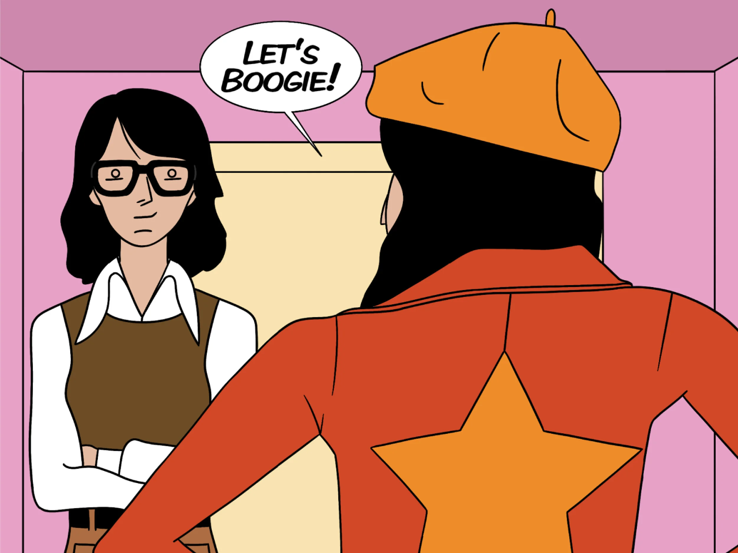
I created an independent comic book called Star Boys, Star Girls. The story focuses on two pairs of blockbuster filmmakers (one male; one female) from two alternate versions of the 70s. With this project, I wanted to combine my design and film background to create a comic book that entertains through satirical humor, fun illustrations, and bright 70’s colors, and that directly addresses the absurdity of auteur behavior and the inequality of the film industry.
Ecoation
Illustration | Animation | Content Creation
Ecoation Innovative Solutions is a tech company in North Vancouver that specializes in creating machines that assess plant health in greenhouses. Working closely with CEO Saber Miresmailli, I created a company Instagram page and conceived of and designed a series of illustrations and animations to be featured on it, which promoted the company’s mission to educate the public about different aspects of greenhouse farming. I also created illustrations to be used as murals for the dining area of the new office.
Wonka Exhibit
Visual Identity | Typography | Illustration | Print Design
Part of Emily Carr University’s 2019 Pop Up Type Museum, my exhibit titled “Wonka: A History of Chocolate Packaging” focuses on the history of typography in chocolate packaging design through experiments with the Willy Wonka brand throughout four time periods: the 1920’s, 1960’s, 1980’s and 2010’s. For each decade, I designed three chocolate wrappers: one to represent what actual chocolate packaging looked like; the second inspired by adjacent design trends of the era; the third evoking the character of Willy Wonka, and how he might’ve desired to be represented through the packaging of his product. In addition, I created ten posters to provide historical context.
Day for Night Cinema
Visual Identity | Typography | Illustration | Print Design
I created the visual identity for a speculative movie theater in Vancouver called Day for Night Cinema. My intention with the brand was to bridge the gap between cinema past and present. For the logo and product design, I incorporated the use of art deco style typography and patterns (the zig-zags straight outta the black lodge from Twin Peaks), and a mono-chromatic illustration of Kim Novak from Alfred Hitchcock’s Vertigo.


